
Article
Best trade show booths: what high-performing B2B exhibits do differently
Patterns from the best trade show booths in B2B halls — layout, messaging hierarchy, demo zones, and staff choreography — without copying consumer spectacle.
Article
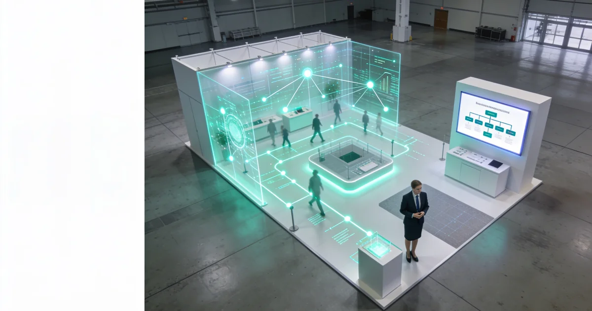
Short answer: The best trade show booths in B2B halls repeat four patterns — open layout flow at the aisle, outcome-first messaging hierarchy readable from 15–30 feet, an aisle-visible demo zone with motion and spot lighting, and greeter–qualifier–demo staff choreography that produces tagged pipeline. Winners stack all four on 10×10 and inline footprints; spectacle, swag walls, and anonymous badge scans are not on the list.
When I walk category rows each season, the booths that outperform neighbors rarely match the "best of" galleries online. Those roundups feature consumer spectacle — prize wheels, celebrity appearances, custom islands priced for Fortune 500 budgets. On a B2B floor, "best" means something quieter: a buyer can parse your offer at walking speed, step in without climbing a counter, see demo motion from twenty feet out, and leave with a next step your rep can defend in CRM. This article is editorial pattern analysis — what high performers repeat across industrial SaaS, medtech, and automation rows — not a how-to layout manual and not an hour-one audit checklist. For execution steps, use our booth design guide; for fail/fix scoring on the floor, use the live booth critique.
What "best" means in B2B (not spectacle)
Search results for "best trade show booths" skew toward visual drama: tallest towers, RGB washes, branded lounges, photo-op installations. Those assets pull camera phones; they rarely pull qualified evaluators on a Tuesday afternoon when your ICP is comparing three vendors in the same hall.
When I score booths from the aisle, I use a B2B definition of best:
- Parse speed — Walker understands the buyer outcome in one glance
- Entry friction — No bunker counter, no maze, no "staff only" signal at the lip
- Motion signal — Demo or loop visible before anyone speaks
- Pipeline signal — Conversations produce role, pain, tier, and next step — not badge scans alone
A 10×10 with those four signals beats a 40×40 island missing two of them. Budget amplifies a working pattern stack; it does not substitute for one. Before you copy a gallery image into a creative brief, ask whether the source booth would pass those four tests on your footprint and headcount — most would not.
Four patterns every high performer repeats
Underperformers often nail one tactic — a sharp headline, a nice demo loop, a friendly greeter — and ignore the rest. High performers stack four patterns. I see the same stack in different categories every 2026 season.
1. Open layout flow
The front third of the footprint stays clear. No high counter across the aisle edge, no tote-bag wall as the first object a walker meets. Greeter stands on the carpet lip; demo sits one step inside, visible past the greeter's shoulder. Side walls carry brand; they do not fence the demo into a back room.
Inline booths need this most — you are not earning corner passive traffic. Islands fail the same way when all four sides present opaque towers with no visible activity. Layout rules by footprint live in our visitor-intent design guide; here I am noting the pattern winners share, not the step-by-step build.
2. Outcome-first messaging hierarchy
Primary line states a buyer result in seven words or fewer at maximum cap height for the booth size. Subhead carries segment or proof at lower panels. Logo supports; it does not dominate the elevation.
Feature-first (common on the row): "Enterprise Integration Platform 4.0"
Outcome-first (high performers): "Cut RFP cycle time in half"
Type specs, contrast hooks, and sales validation workflow are in our booth headline guide. The pattern: hierarchy serves aisle speed, not brand book drama.
3. Aisle-visible demo zone
One monitor or hands-on station angled 15–30° toward traffic. Loop length ≤90 seconds on hardware already shipped. Clip-on LED spot on the demo plinth under flat hall lighting. Static backdrops without motion read dead — buyers walk past polished walls that signal nothing happening.
Demo placement is a layout choice and a staffing choice. The zone sits where qualifier and greeter can hand off without blocking the only entry path on a 10×10.
4. Greeter–qualifier–demo choreography
Continuous lip coverage: one greeter on the aisle edge at all times during peak ingress. Qualifier at the demo station — role, timeline, pain, next step before the visitor leaves. Demo rep runs the station but does not block entry.
No swag-first greetings. No back-of-booth huddles while the lip sits empty for three-minute stretches. Staff choreography is the zero-cost pattern competitors with bigger builds most often skip — and the one I score first in a live booth critique.
| Pattern | High performer signal | Underperformer signal |
|---|---|---|
| Layout flow | Open front third, demo visible from aisle | Bunker counter, demo hidden behind walls |
| Messaging hierarchy | Outcome headline at max cap height | Logo-dominant, feature-speak, squint required |
| Demo zone | Motion loop angled toward traffic, spot-lit | Static backdrop, inward-facing screens |
| Staff choreography | Greeter on lip + qualifier at demo continuously | Empty lip, swag-first, scan without notes |
Three anonymized composites from the floor
I do not cite named clients — vendor case studies too often read as fiction. Below are composite profiles built from repeated observations across halls. Treat them as pattern illustrations, not copy-paste templates.
Composite A: Industrial SaaS, 20×20 inline
Footprint: Inline row, category-dense, no island budget.
Pattern stack: Open lip with no counter. Primary headline: "Quote complex SKUs in minutes, not days." Subhead names ICP segment at lower cap height. One 27-inch monitor on a low plinth angled toward the aisle running a 75-second loop of a live quote flow. Greeter delivers the headline hook; qualifier at the plinth captures eval status and books a follow-up slot. Swag stored behind the demo — question before gift.
Why it worked: Buyers on the row could parse the outcome and see motion without entering. Staff never left the lip empty during the first ninety minutes post-keynote.
Composite B: Medtech compliance vendor, 10×10 corner
Footprint: Corner end-cap, tight headcount (three reps rotating).
Pattern stack: Contrast headline: "Manual audit prep → pass in 48 hours." Single entry from the primary aisle — no furniture maze. Hands-on sample kit at chest height on a plinth one step inside the greeter. Two roles only: greeter on lip, qualifier/demo at plinth. No literature rack at the edge.
Why it worked: Corner traffic is passive; the open front and visible sample pulled stops competitors with larger graphics but closed fronts missed. Qualification happened at the plinth — not after a swag handoff.
Composite C: Manufacturing automation, 20×20 island
Footprint: Island with three approach paths, six staff across two shifts.
Pattern stack: Demo stations on outer edges facing each aisle — not a central fortress. Core holds storage and seated meetings for pre-booked slots. Outcome headline on each outward face: "Reduce changeover downtime 30%." No prize wheel, no spectacle lounge. Greeter assigned per face during peak; qualifier rotates with demo rep per station.
Why it worked: Island square footage bought 360° exposure; outer-edge demos made each face behave like an open inline booth. Pre-booked meetings in the core bypassed aisle lottery — a tactic from our crowded-hall differentiation playbook.
Pattern stack vs single tactic
Composite B would fail if the headline were feature-first. Composite A would fail if staff clustered at the back. Composite C would fail if demos faced inward. High performers treat the four patterns as a stack — weaken one layer and the others compensate less than teams expect.
When a booth underperforms, I diagnose which layer broke first:
- Layout — Was the front third blocked?
- Messaging — Could you read the outcome at 15–30 feet?
- Demo — Was motion visible from the aisle?
- Staff — Was the lip continuously covered?
Fix the weakest layer before spending on upgrades. Wrong-show selection breaks every layer — shortlist fairs where ICP density rewards the stack on ExhibitionsVoice before you scale spend.
Apply the pattern stack before move-in
Use this sequence once per show cycle — pattern analysis here, execution detail in linked playbooks:
- Score the four patterns on your proof — pass/fail each before graphics lock
- Build layout using the visitor-intent design guide — open front, circulation by footprint, demo sight lines
- Lock headline hierarchy via the headline guide — seven-word primary, contrast hook if crowded row
- Rehearse staff roles — greeter script, qualifier fields, demo handoff; no swag-first
- Run move-in checklist from our booth setup walkthrough — demo loop live before doors, lip assignment posted
- Audit hour one with the live critique framework — fix rearrangement issues before day-two peaks
- Differentiate on crowded rows with outcome contrast and pre-booked meetings per the differentiation playbook
Gallery inspiration is optional. Pattern discipline is mandatory. The best booths I score each season would look understated in a spectacle roundup — and that is the point.
FAQ
What makes the best trade show booths in B2B?
The best B2B booths combine four patterns: open layout flow at the aisle, outcome-first messaging hierarchy readable from 15–30 feet, a demo zone with visible motion from the aisle, and greeter–qualifier–demo staff choreography that produces tagged pipeline — not spectacle, swag bait, or anonymous badge scans.
What are the most common patterns in high-performing trade show booths?
Open front with no bunker counter, primary outcome headline at maximum cap height, demo monitor or hands-on station angled 15–30° toward traffic with a ≤90-second loop, and staff split with one greeter on the aisle lip continuously plus a qualifier at the demo station.
Do the best trade show booths need big budgets or custom builds?
No. High performers on 10×10 and inline footprints win with pattern discipline — rearrangement, headline hierarchy, demo sight lines, and staff roles — not custom millwork or island square footage. Budget upgrades amplify a working pattern stack; they do not replace it.
How do demo zones differ in the best B2B booths?
Demo zones sit one step inside the greeter line, visible past the greeter's shoulder from the aisle. Motion — screen loop, hands-on sample, or live output — is spot-lit and angled toward traffic. Static backdrops without visible activity read dead regardless of fabric spend.
How should staff be choreographed in a high-performing booth?
Greeter on the aisle lip at all times delivering the outcome hook; qualifier at the demo station capturing role, pain, tier, and next step; demo rep running the station without blocking the only entry path on small footprints. No swag-first greetings, no back-of-booth huddles during peak ingress.
How is this different from a booth design how-to or live critique?
This article synthesizes positive patterns winners repeat — editorial observation, not step-by-step layout instructions (see the design how-to) or hour-one fail/fix audit (see the live critique). Use all three: patterns to emulate, how-to to build, critique to verify on the floor.
What 'best' means in B2B (not spectacle)
When I score booths from the aisle, 'best' is not tallest rigging or loudest AV. Best means a buyer can parse the offer at walking speed, step in without a barrier, see demo motion from twenty feet, and leave with a tagged next step — pipeline discipline, not Instagram moments.
Four patterns every high performer repeats
Open layout flow with a clear front third. Outcome-first messaging hierarchy on the elevation. Demo zone visible and lit from the aisle. Greeter–qualifier–demo staff choreography with continuous lip coverage. Winners stack all four; underperformers nail one and ignore the rest.
Anonymized composite profiles from the floor
Industrial SaaS inline (20×20): open lip, seven-word outcome headline, 90-second loop angled toward traffic, no swag wall. Medtech compliance 10×10 corner: contrast pain/outcome headline, greeter plus qualifier only, demo plinth at chest height. Manufacturing automation island: three circulation paths, demo stations on outer edges, meetings in core — no prize wheel, no spectacle.
Pattern stack checklist before move-in
Score each pattern pass/fail before graphics lock. Cross-link to design how-to for layout execution, live critique for hour-one audit, setup walkthrough for move-in sequence, headline guide for copy specs, differentiation playbook for crowded rows, and /tradeshows for calendar fit.
Common exhibitor questions
What makes the best trade show booths in B2B?
The best B2B booths combine four patterns: open layout flow at the aisle, outcome-first messaging hierarchy readable from 15–30 feet, a demo zone with visible motion from the aisle, and greeter–qualifier–demo staff choreography that produces tagged pipeline — not spectacle, swag bait, or anonymous badge scans.
What are the most common patterns in high-performing trade show booths?
Open front with no bunker counter, primary outcome headline at maximum cap height, demo monitor or hands-on station angled 15–30° toward traffic with a ≤90-second loop, and staff split with one greeter on the aisle lip continuously plus a qualifier at the demo station.
Do the best trade show booths need big budgets or custom builds?
No. High performers on 10×10 and inline footprints win with pattern discipline — rearrangement, headline hierarchy, demo sight lines, and staff roles — not custom millwork or island square footage. Budget upgrades amplify a working pattern stack; they do not replace it.
How do demo zones differ in the best B2B booths?
Demo zones sit one step inside the greeter line, visible past the greeter's shoulder from the aisle. Motion — screen loop, hands-on sample, or live output — is spot-lit and angled toward traffic. Static backdrops without visible activity read dead regardless of fabric spend.
How should staff be choreographed in a high-performing booth?
Greeter on the aisle lip at all times delivering the outcome hook; qualifier at the demo station capturing role, pain, tier, and next step; demo rep running the station without blocking the only entry path on small footprints. No swag-first greetings, no back-of-booth huddles during peak ingress.
How is this different from a booth design how-to or live critique?
This article synthesizes positive patterns winners repeat — editorial observation, not step-by-step layout instructions (see the design how-to) or hour-one fail/fix audit (see the live critique). Use all three: patterns to emulate, how-to to build, critique to verify on the floor.
Editorial standards & corrections
This guide is maintained by the ExhibitionsVoice editorial team. We cross-check dates, venues, and organizer names against official sources before listing events. Spot an error? Use our contact form with the event URL and corrected details — every correction request is read by editorial.
Read more: About ExhibitionsVoice · FAQs · All exhibitor guides
Related articles
Oil and gas trade shows 2026: energy calendar and how to pick
Oil and gas trade shows for 2026 — ADIPEC, WETEX, and offshore energy fairs we score for NOC, IOC, and energy-tech exhibitors.
CPHI India 2026 exhibitor guide: Delhi pharma ingredients floor
CPHI India 2026 exhibitor guide for 23-25 November at IICC Yashobhoomi, New Delhi — API, CDMO, and packaging teams scoring South Asia's ingredients floor.
Fintech trade shows 2026: payments calendar and how to pick
Fintech and payments trade shows for 2026 — Money20/20 USA, Sibos, and how banks and vendors pick Tier A/B/C money-ecosystem floors.
ADIPEC 2026 exhibitor guide: Abu Dhabi energy floor
ADIPEC 2026 exhibitor guide for 2-5 November at ADNEC Centre Abu Dhabi — who should exhibit, hall logistics, and how we score the energy floor.