
Article
How to design a booth people want to visit (visitor-intent layout)
Visitor-intent booth design for B2B fairs — open fronts, demo sight lines, headline hierarchy, and layout patterns that invite stops without bigger spend.
Article
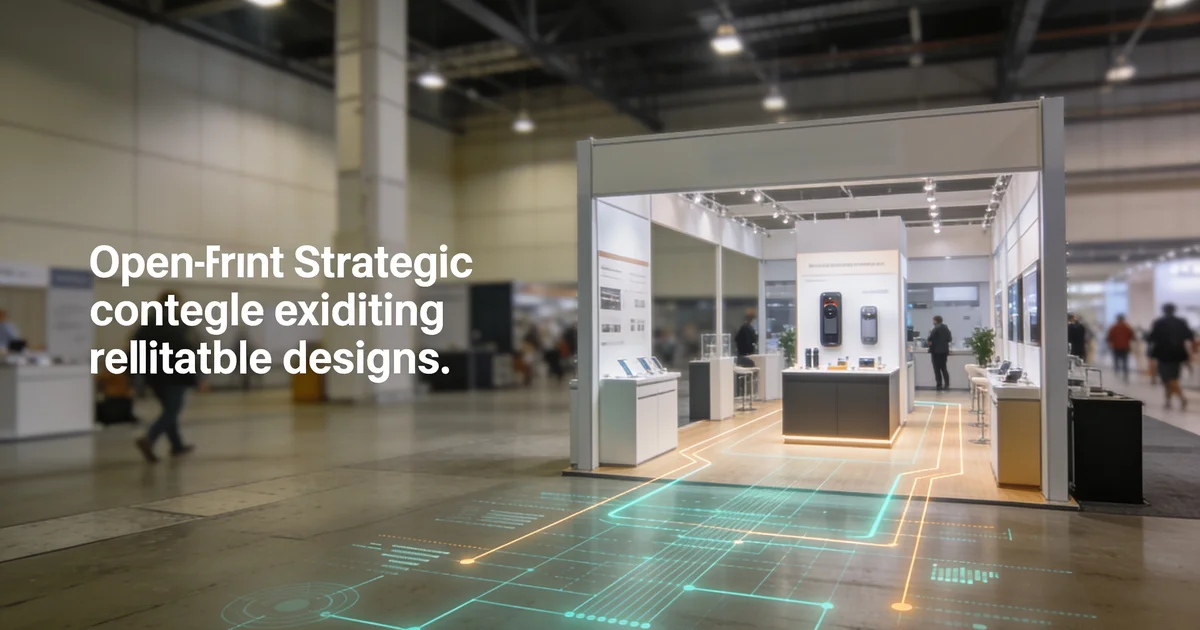
Short answer: Design a booth people want to visit with an open front (no bunker walls at the aisle), a demo or motion loop visible from 20 feet, outcome-first headline hierarchy on the header, circulation paths matched to footprint (single-entry 10×10 vs multi-side island), spot lighting on the demo zone, a 36-inch accessible entry path, and budget swaps that rearrange what you already own — not a custom agency rebuild.
When I review exhibitor booth photos from the aisle each season, the pattern is consistent: the renders looked award-worthy in the vendor deck, but on the floor the layout reads closed, the demo hides behind a counter, and the headline shrinks to feature-speak nobody parses at walking speed. Buyers do not stop for pretty portfolios — they stop when the booth signals an open conversation about a problem they already own. This guide is the visitor-intent layout framework I use before any 2026 graphics go to print — practical circulation and sight-line rules, not another gallery of island builds your budget cannot touch.
Visitor-intent design beats portfolio aesthetics
Agency portfolios optimize for photography angles and brand drama. Aisle traffic optimizes for a different question: Can a buyer tell in one glance what happens here and whether they are welcome to step in? When those answers are unclear, foot traffic stalls regardless of spend on fabric, rigging, or furniture grade.
I score booth proofs on three visitor-intent tests before approving layout:
- Open signal — Is the front third of the footprint clear, with staff and demo visible from the aisle?
- Motion signal — Can a walker see activity (screen loop, hands-on sample, live output) from ~20 feet without entering?
- Outcome signal — Does the primary headline state a buyer result in language readable at aisle speed?
Fail any one test and you are paying for a display case, not a conversation starter. Pair layout work with our guide to more booth visitors without raising budget — many fixes are placement and discipline, not new line items. And if the fair itself is wrong for your ICP, no layout saves the deposit — that is mistake #1 in our five biggest trade show mistakes list; shortlist better fits on ExhibitionsVoice before you finalize build plans.
Open front vs closed bunker
The most common layout failure I see on inline rows is the closed bunker: high counter across the aisle edge, solid side walls, demo tucked behind staff, literature rack as the first object a walker meets. It reads "private office," not "step in and ask."
An open front does the opposite:
- No barrier counter at the aisle lip — store bags, brochures, and swag behind the demo station or on a low shelf at the back
- Front third clear — greeter stands on the carpet edge, not behind furniture
- Side walls for brand, not fence — graphics and storage yes; opaque walls that block sight lines into the demo, no
- Single obvious entry on 10×10 — one path in, no maze of plinths
Corner and end-cap footprints earn passive traffic; inline booths must manufacture it with an open front. Islands fail the same way when all four sides present tall opaque towers with no visible activity — you paid for 360° exposure and built a fortress.
Demo visibility from the aisle
A static backdrop without motion reads dead on a busy aisle. Buyers default to booths where something is happening — a hands-on station, a 90-second screen loop, or live output they can recognize from twenty feet out.
Rules I enforce on every layout proof:
- Angle one monitor toward the aisle — 15–30° is enough; do not bury screens facing only inward
- Hands-on sample on a plinth at chest height — product buyers can touch beats a graphic they cannot parse
- Loop length ≤90 seconds — long videos lose walkers; show the outcome fast
- Demo behind greeter, not behind walls — qualifier and demo station sit one step off the aisle, visible past the greeter's shoulder
You do not need new AV budget if the laptop and monitor you already ship can run the loop. Reuse scripts from your last webinar or customer call. When the demo is live, tie staff roles to our two-minute qualification workflow — greeter on the lip, qualifier at the station — so visible motion converts to tagged pipeline, not unpaid consulting.
Headline hierarchy on the elevation
Layout and copy work together. A open front pulls stops; a unreadable headline wastes them. I require a three-tier hierarchy on every elevation facing an aisle:
- Primary headline — buyer outcome, seven words or fewer, maximum cap height for the footprint
- Subhead — segment, proof, or product name at 2–4 inch cap height depending on booth size
- CTA line — conversation starter on counter fascia or lower panel ("Ask about your slowest RFP cycle")
On a 10×10, target 4–5 inch primary cap height readable from ~15–20 feet. On a 20×20 island, target 8–12 inch primary readable from ~30 feet, repeated on at most two elevations — not three different messages competing for attention.
Full type specs, contrast hooks, and sales validation workflow live in our booth headline guide. Layout proofs should be rejected if the headline panel blocks demo sight lines — tall header fabric that hides the screen is a trade I rarely accept on inline booths.
Traffic flow: 10×10 vs island
Circulation rules change by footprint. Applying island logic to a 10×10 creates clutter; applying inline logic to an island wastes perimeter exposure.
10×10 inline or corner
- Single entry from the primary aisle — greeter owns that edge
- Demo station immediately inside the entry line, visible from outside
- Storage, bags, and secondary literature at the back wall — not between buyer and demo
- No meeting table in the footprint unless the show is by-appointment only; tables eat the only circulation path
20×20 island or peninsula
- Three circulation paths minimum — avoid dead-end pockets buyers cannot exit without backing out
- Demo stations on outer edges facing each open aisle; core for storage and seated meetings
- Headline readable from approach angles, not just head-on — walkers see you from two aisles at once
- Peninsula: treat the open side like a 10×10 front; do not close it with a barrier because "we have a back wall"
| Footprint | Entry model | Demo placement | Common mistake |
|---|---|---|---|
| 10×10 inline | Single open front | One station, aisle-visible | High counter + table blocks only path |
| 10×10 corner | Primary + secondary approach | Angle demo to primary aisle | Treating both sides as "back office" |
| 20×20 island | Multi-side open circulation | Stations on outer edges | Four solid towers, no visible activity |
| Peninsula | Open side + partial back | Demo on open side edge | Closing the open side with furniture |
Confirm footprint and orientation when you book — a 180° flip on move-in destroys a flow plan. Our booth setup walkthrough covers move-in sequence once the layout is locked.
Lighting and motion cues
Hall lighting is flat and yellow-heavy. Without intentional spots, your demo zone disappears into the background noise of neighboring booths.
- Spot the demo, not the logo wall — one clip-on LED or show-approved arm targets the screen or sample
- Avoid dark corners — if buyers cannot see staff faces, they skip
- No strobe or aggressive pulse — motion should signal activity, not carnival; B2B buyers filter gimmicks fast
- Screen brightness — test under hall lights on move-in, not in a dim hotel room; glare kills readability
Motion and light work as passive greeters when staff rotate off the lip for a break. A loop running on a spotted monitor continues to pull looks — static fabric does not.
Accessibility on the floor
Accessible entry is not a compliance footnote — it is traffic you otherwise turn away. I require these minimums on every layout brief:
- 36-inch clear path through the entry and to the demo — no narrowing plinths or bag stacks
- No step-up platforms without a ramp; raised demo floors exclude wheelchair users and anyone with mobility limitations
- Counter height — where possible, include a section at 34–36 inches with knee clearance for seated conversations
- Screen content — high contrast; do not rely on color alone for critical demo labels
Many halls publish accessibility guidelines in the exhibitor manual — verify ramp requests at booking if your design includes a raised stage. Closing your only entry with a demo plinth fails both accessibility and traffic goals.
Budget-conscious layout swaps
Most visitor-intent fixes are rearrangement, not a rebuild. When finance will not approve a new exhibit this cycle, I prioritize swaps by impact per dollar:
- Remove the aisle barrier counter — zero cost; largest traffic lift on inline booths
- Rotate one monitor 15–30° toward the aisle — zero cost if hardware already ships
- Swap opaque side panels for low open shelving — often reuses existing hardware; improves sight lines
- Clip-on LED spots on the demo zone — low cost; high visibility return under hall lighting
- Drop the meeting table from the 10×10 — frees circulation; book meetings in hall lounges or pre-show
- Lower literature density at the front — one QR to a PDF beats a rack that blocks the greeter
Skip the rebrand and the custom millwork pitch until traffic mechanics work on the footprint you have. Design for stops first; aesthetics second — buyers remember whether they could see your demo, not whether your fabric gradient matched the mood board.
Pre-show layout checklist
- Open front confirmed — no barrier counter; front third clear on proof
- Demo visible from 20 feet — screen angle, loop ready, spot planned
- Headline hierarchy locked — primary, subhead, CTA per footprint type specs
- Circulation mapped — 10×10 single entry or island multi-path; no dead ends
- Accessibility minimums — 36-inch path, no step-up without ramp
- Staff roles assigned — greeter on lip, qualifier at demo; aligns with setup walkthrough
- Fair fit verified — ICP density scored; calendar shortlist on ExhibitionsVoice
Run this checklist at the layout proof stage — not on move-in when union labor is on the clock. A rejected proof costs hours; a rejected bunker on hour one of the show costs pipeline.
FAQ
How do I design a trade show booth that attracts visitors?
Use an open front with no barrier counter at the aisle, place a demo or motion loop visible from about twenty feet, and lead with an outcome-first headline at readable cap height. Design for stops and conversations — not a closed display case that photographs well but reads dead on the floor.
Should my booth be open or have walls?
Open at the aisle edge. Side and back walls carry brand and storage; the front third stays clear for greeters and demo sight lines. High counters and opaque barriers create a bunker that buyers walk past without slowing down.
What is the best layout for a 10×10 trade show booth?
Single open entry from the primary aisle, greeter on the lip, one demo station visible from outside, storage and literature at the back wall — no meeting table or furniture blocking the only circulation path.
How do I make my demo visible from the aisle?
Angle a monitor or hands-on sample toward the aisle, run a 90-second loop on hardware you already ship, and spot-light the demo zone. Motion visible from twenty feet pulls stops that static backdrops miss entirely.
What booth design changes work on a tight budget?
Remove the aisle barrier counter, rotate one screen toward traffic, swap opaque side panels for low open shelving, and add clip-on LED spots on the demo — rearrangement and small accessories, not a custom rebuild.
Does booth design affect lead quality or just traffic?
Both. Open layouts and visible demos increase stops; outcome-first headlines and CTA lines filter for ICP buyers who recognize the problem. Pair layout with our two-minute qualification script so extra traffic converts to tagged hot, warm, and cold pipeline in CRM.
Visitor-intent design beats portfolio aesthetics
Buyers decide in one glance whether your booth is open for business or closed for display. I audit aisle photos each season — underperformers share bunker walls, hidden demos, and headlines nobody can read at walking speed. Design for stops, not renderings.
Open front vs closed bunker
Remove barrier counters at the aisle edge. Keep the front third clear. A closed bunker signals "staff only" — an open front invites a thirty-second conversation. Inline booths need this most; islands still fail when three sides read as walls.
Demo visibility from the aisle
Angle one screen or hands-on station toward the aisle so motion is visible from 20 feet. A polished backdrop without movement reads dead. Reuse demo hardware you already ship — no new AV budget required if the loop runs on existing equipment.
Headline hierarchy on the elevation
Primary outcome line at maximum cap height; subhead and CTA at lower panels. Seven words or fewer on the hero. See our booth headline guide for footprint type specs before print.
Traffic flow: 10×10 vs island
10×10: single entry, greeter on aisle lip, demo behind — no dead-end furniture. 20×20 island: three circulation paths, demo stations on outer edges, storage and meetings in the core. Never block approach angles with tall opaque walls.
Lighting and motion cues
Spot the demo station, not the logo wall. A slow screen loop or hands-on sample beats static graphics. Avoid strobing or dark corners — buyers skip booths they cannot parse in one glance.
Accessibility on the floor
Minimum 36-inch clear path, no step-up platforms without ramp, counter height with knee clearance where possible. Accessible entry is not optional — it is traffic you otherwise turn away.
Budget-conscious layout swaps
Remove the high counter, rotate one monitor toward the aisle, swap closed side panels for low shelving, use clip-on LED spots on the demo. Most high-impact moves cost rearrangement time, not a new build.
Common exhibitor questions
How do I design a trade show booth that attracts visitors?
Use an open front with no barrier counter, place a visible demo or motion loop facing the aisle, and lead with an outcome-first headline readable from 20 feet. Design for stops and conversations — not a closed display case.
Should my booth be open or have walls?
Open at the aisle edge. Walls and high counters create a bunker that reads closed. Use side and back walls for branding and storage; keep the front third clear for greeters and demo sight lines.
What is the best layout for a 10x10 trade show booth?
Single open entry from the aisle, greeter on the lip, demo station visible from 20 feet, literature and bags behind the demo — no dead-end furniture blocking the only approach path.
How do I make my demo visible from the aisle?
Angle a monitor or hands-on station toward the aisle, run a 90-second loop on existing hardware, and spot-light the demo zone. Motion visible from twenty feet pulls stops static backdrops miss.
What booth design changes work on a tight budget?
Remove the aisle barrier counter, rotate one screen toward traffic, swap opaque side panels for low open shelving, and add clip-on LED spots on the demo station — rearrangement, not a rebuild.
Does booth design affect lead quality or just traffic?
Both. Open layouts pull more stops; headline and demo placement filter for ICP buyers who recognize the outcome. Pair layout with a two-minute qualification script so traffic converts to pipeline.
Editorial standards & corrections
This guide is maintained by the ExhibitionsVoice editorial team. We cross-check dates, venues, and organizer names against official sources before listing events. Spot an error? Use our contact form with the event URL and corrected details — every correction request is read by editorial.
Read more: About ExhibitionsVoice · FAQs · All exhibitor guides
Related articles
Oil and gas trade shows 2026: energy calendar and how to pick
Oil and gas trade shows for 2026 — ADIPEC, WETEX, and offshore energy fairs we score for NOC, IOC, and energy-tech exhibitors.
CPHI India 2026 exhibitor guide: Delhi pharma ingredients floor
CPHI India 2026 exhibitor guide for 23-25 November at IICC Yashobhoomi, New Delhi — API, CDMO, and packaging teams scoring South Asia's ingredients floor.
Fintech trade shows 2026: payments calendar and how to pick
Fintech and payments trade shows for 2026 — Money20/20 USA, Sibos, and how banks and vendors pick Tier A/B/C money-ecosystem floors.
ADIPEC 2026 exhibitor guide: Abu Dhabi energy floor
ADIPEC 2026 exhibitor guide for 2-5 November at ADNEC Centre Abu Dhabi — who should exhibit, hall logistics, and how we score the energy floor.